Overview
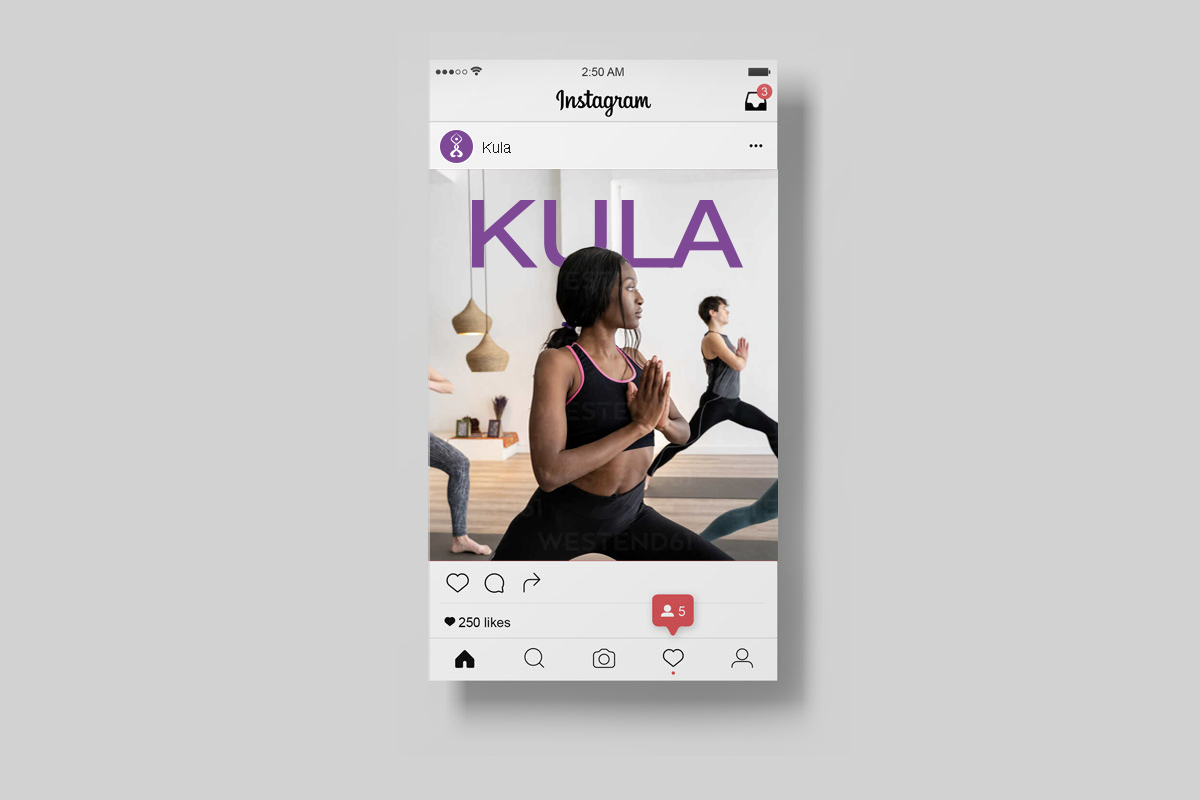
KULA, an emerging startup brand, is on the cusp of establishing its presence in the vicinity of Atlanta, GA. As a yoga studio, KULA is committed to serving the local community, placing a strong emphasis on diversity, harmony, and communal well-being through the practice of yoga. At the core of its mission lies the aspiration to foster a nurturing environment where individuals from various backgrounds, especially minorities, feel embraced and empowered to fully immerse themselves in yoga and meditation. KULA places a premium on creating a safe and inclusive space that nurtures personal authenticity and holistic wellness.
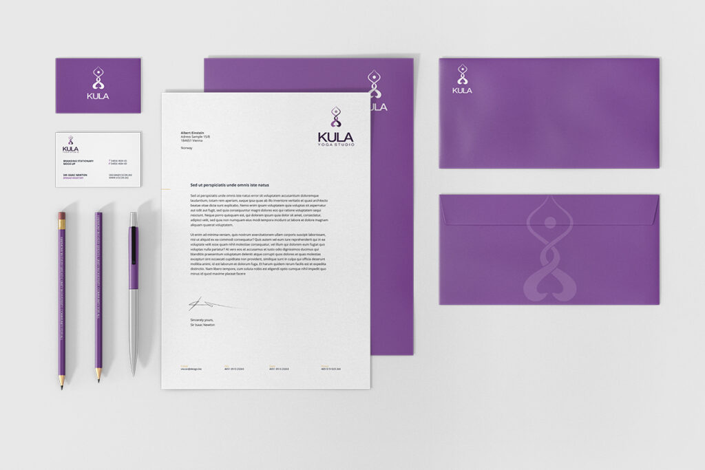
The owner approached me with a degree of uncertainty regarding the brand’s direction but expressed a desire to incorporate the Ghanaian symbol for Chain Link into the final logo. Additionally, she sought differentiation within the competitive landscape of yoga studios in Atlanta, as well as a design suitable for apparel branding and the promotion of body oils.
Through meticulous research, competitor analysis, and a thorough understanding of the target market, I devised a solution to address her needs.
Creative Concept
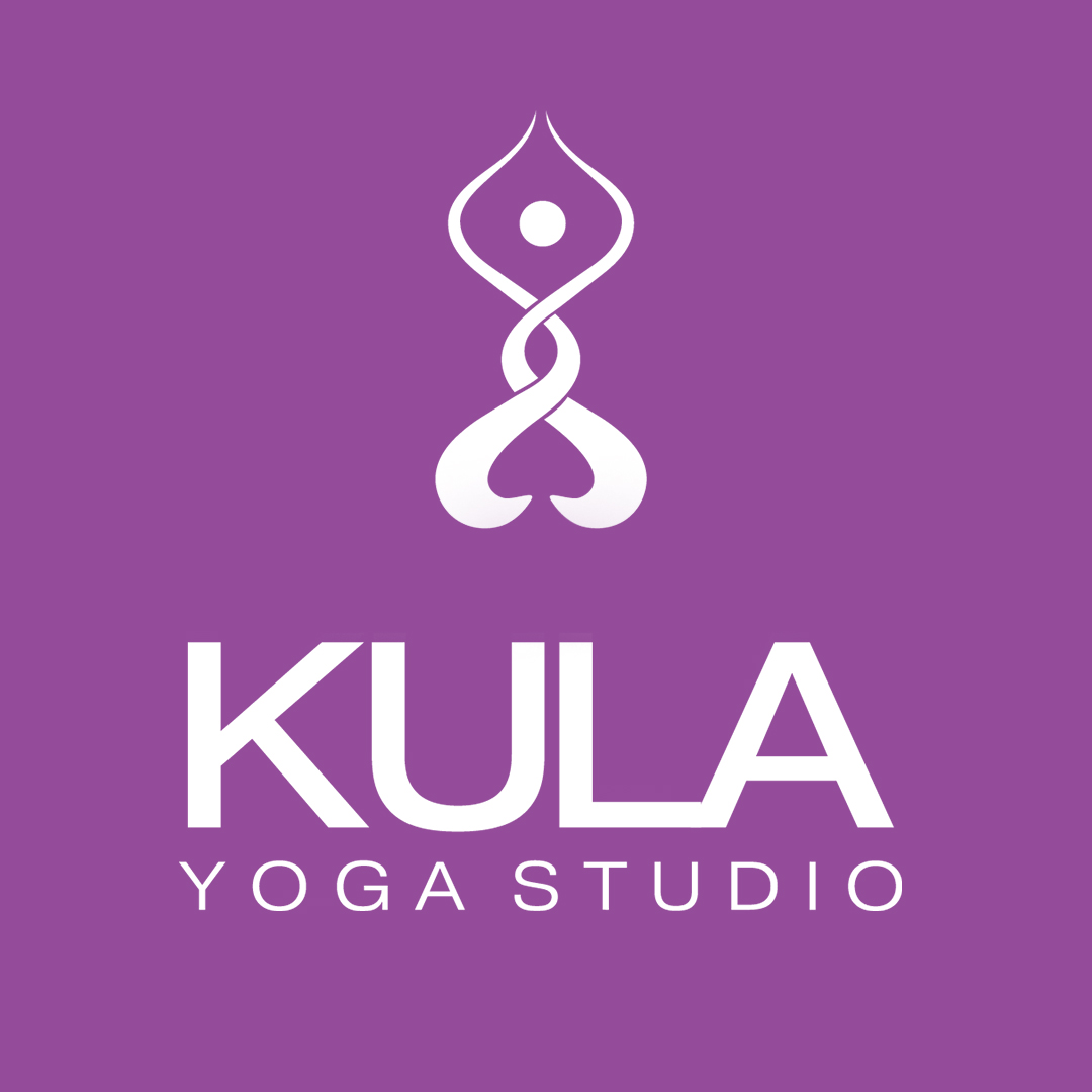
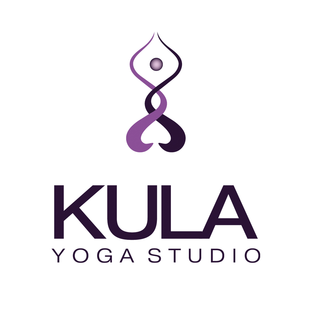
The logo concept is inspired by the Ghanaian symbol representing chain link and unity, integrating elements of community and diversity. This symbol, renowned for its representation of interconnectedness and strength through unity, forms the cornerstone of the design, inherently conveying a sense of cohesion and togetherness.
Strategic incorporation of the key word “community” into the design is achieved through the use of a circular shape, symbolizing various aspects of community: connection, support, inclusivity, and growth. The arrangement of the circle in a cohesive manner underscores the interconnected nature of communities, emphasizing their collective effort towards common objectives. The circular form itself conveys continuity and wholeness, reinforcing the notion of unity within the community.
A two-color concept is adopted to reflect diversity within the community. By employing two distinct colors, the logo celebrates the richness of diversity while acknowledging the unique contributions of each individual. Carefully selected hues complement each other while maintaining distinctiveness, symbolizing the beauty of embracing differences and fostering unity.
Furthermore, subtle modifications to the Ghanaian symbol evoke a Yoga pose, adding a distinctive and recognizable element that resonates with the target audience. This adaptation not only enhances visual appeal but also establishes a connection between the logo and the practice of Yoga, appealing to individuals interested in health, wellness, and mindfulness.
In summary, the logo concept draws upon the Ghanaian symbol of chain link and unity, integrating elements of community, diversity, and Yoga to craft a visually compelling design that resonates with its intended audience. Through thoughtful symbolism and design choices, the logo effectively communicates the values of connection, inclusivity, and growth within the represented community.