A fire-grilled plant-based identity with flavor, attitude, and a place for everyone.
BRAND STRATEGY | IDENTITY | ART DIRECTION
PROJECT
The Veggie Pit
ROLE
Brand strategy, brand identity, art direction
CATEGORY
Restaurant brand concept
TOUCHPOINTS
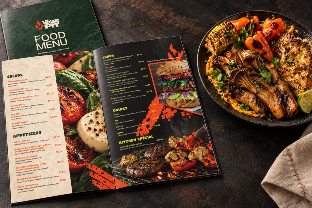
Print, packaging, space, social
THE IDEA
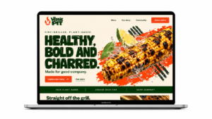
The challenge was to make fire-grilled vegan food feel craveable and culturally alive. I built the identity around the contrast between fresh ingredients and the intensity of the grill, with community at its heart.
Healthy
Recognizable ingredients, fresh color, and photography that lets the food speak.
Bold
Big typography, confident contrast, and a voice that
invites people to the table.
Charred
Rough ink, grill marks, and a flame that make the cooking method part of the identity.
THE IDENTITY
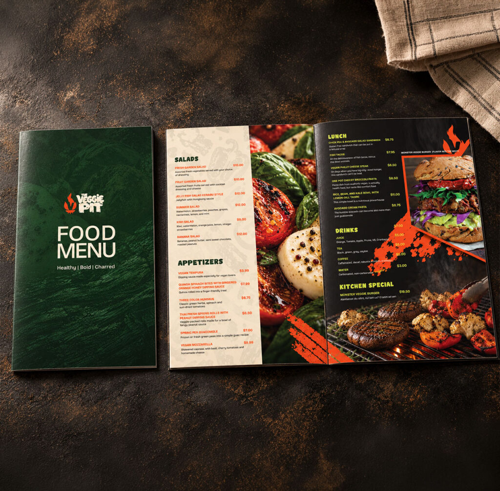
Primary Mark with charred finish
Fire Pit Logo Identity
The custom made, V-shaped flame anchors the system. Chunky, custom-made lettering library with meticulously applied charred surface to every letter give the wordmark the same character as the food: direct, tactile, and full of flavor.
Vibrant Flavor.
Great Company.
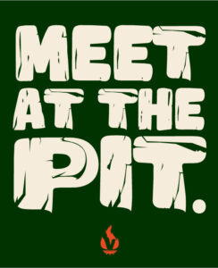
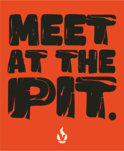
The custom wordmark owns the signature. Expressive display type carries the energy, while clean supporting text keeps the story easy to read.
VEGGIE GREEN
#003301
EMBER ORANGE
#f14c28
CHARCOAL BLACK
#20221b
HEALTHY LIME
#cddb44
WARM ROASTED PIT
#f4efe4
Bricolage Grotesque
Supporting title font
THE VISUAL LANGUAGE/ PATTERN SYSTEM
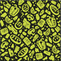
Repeated Flavor in Style
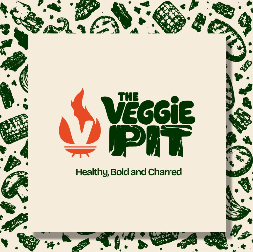
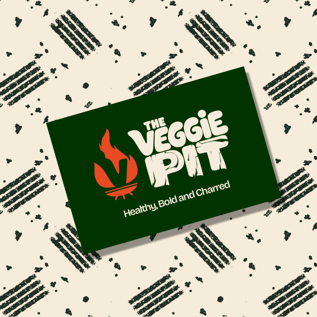
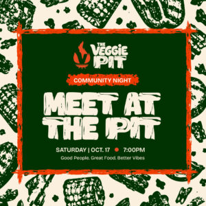
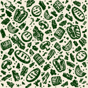
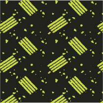
The patterns carry the character beyond the logo. One takes its rhythm from the grill; the other turns the ingredients into a textured vegetable print.
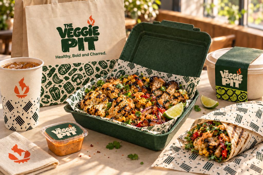
Charred vegetables / A characterful print for feature walls, takeaway bags, and tray liners.
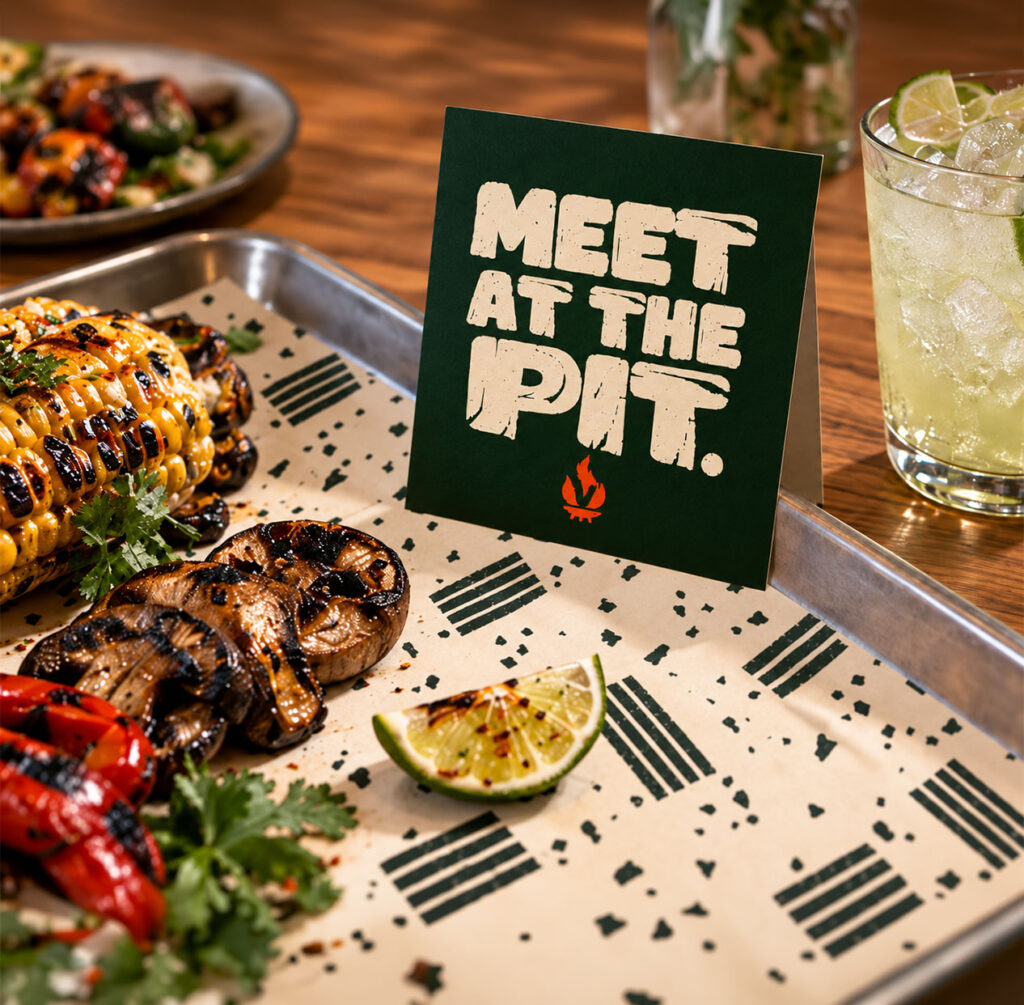
Grill marks / A quieter rhythm for cups, wraps, counter tiles, and social borders.
THE BRAND IN ACTION
A Brand You Can Taste and Feel
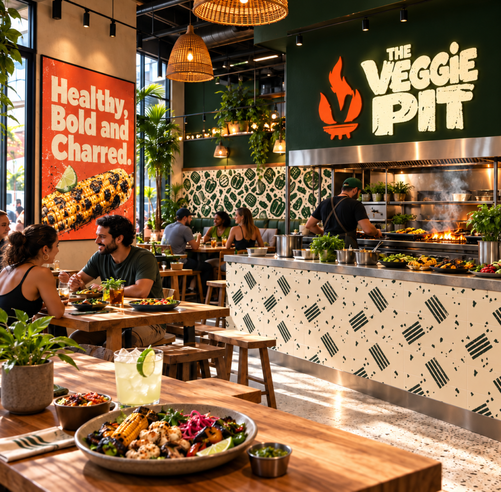
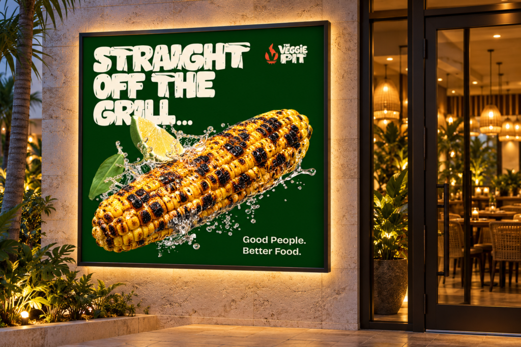
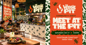
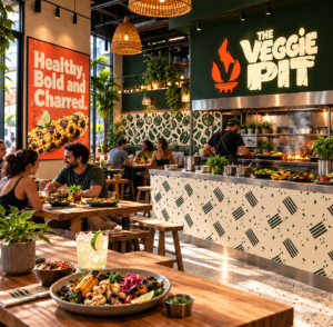
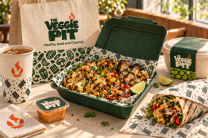
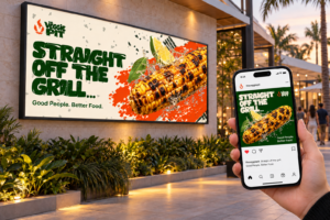
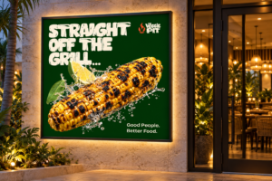
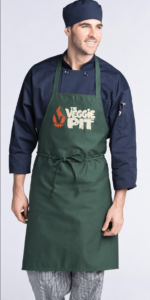
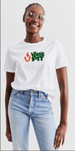
The restaurant and takeaway system turn the identity into everyday experiences. Pattern scale, open space, and orange accents keep each touchpoint connected.
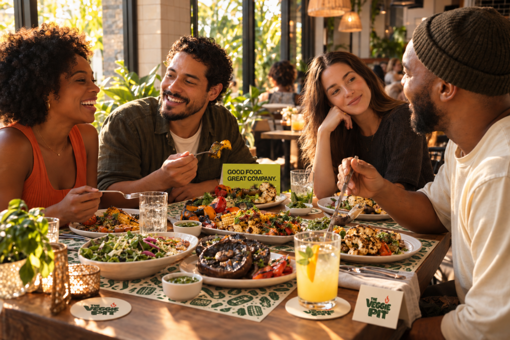
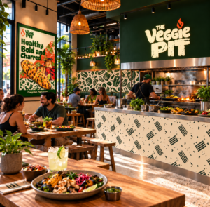
The environment/ gathering around the grill
Large vegetable prints create a destination; smaller grill marks bring rhythm to the counter and table.
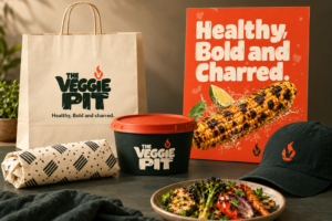
Vegetable prints on bags and liners. Grill marks on cups and wraps. Clear space keeps the charred logo visible.
ART DIRECTION
Culture That Breaks The Frame
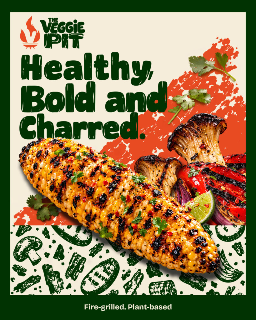
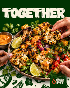
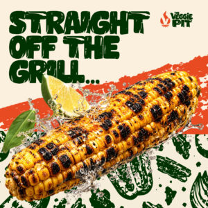
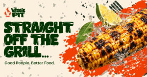
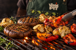
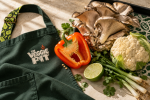
I treated the food as part of the graphic language. Vegetables cross the type and pattern borders, while real sear marks echo the printed strokes.
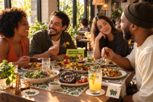
Show the freshness.
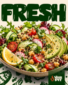
Herbs, lime, and recognizable ingredients add life.
Keep the heat.
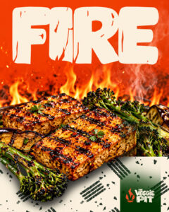
Directional light and visible char make flavor tangible.
Make it move.
Overlapping layers and diagonal crops give still images energy.
SOCIAL MEDIA
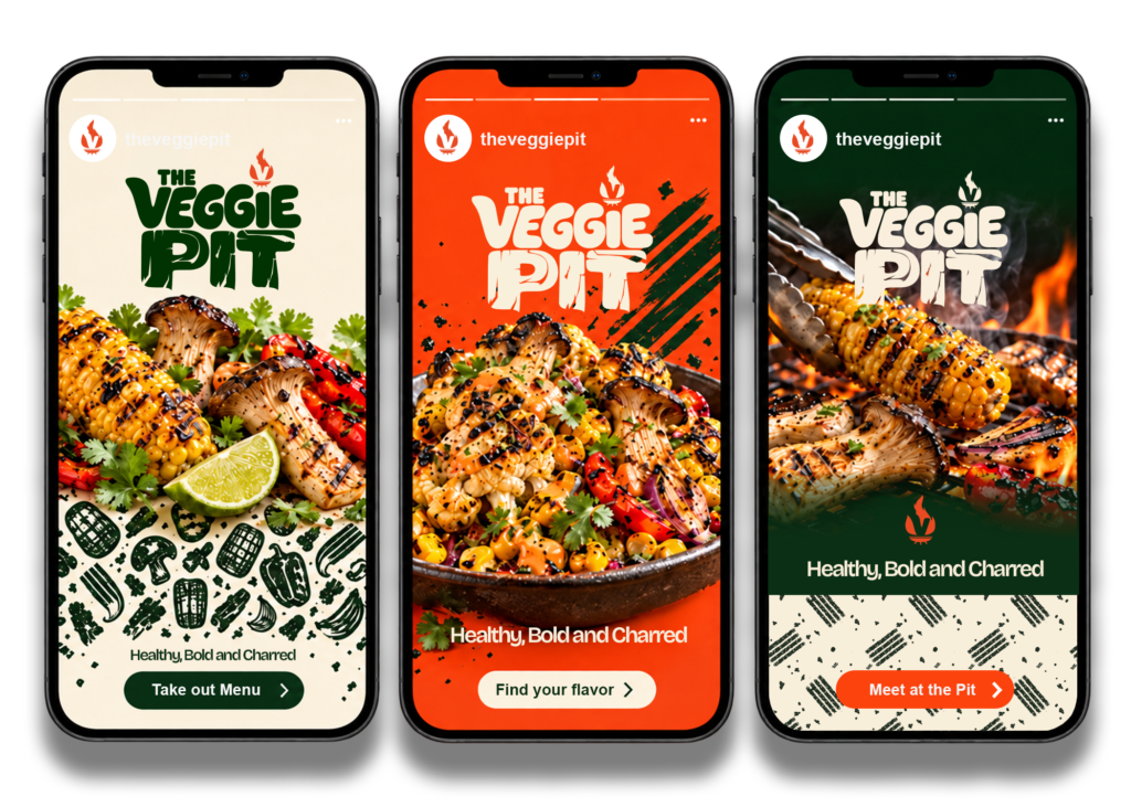
Concepts Adapted To The Digital World.
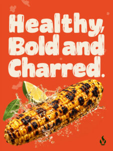
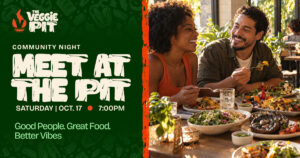
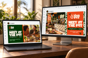
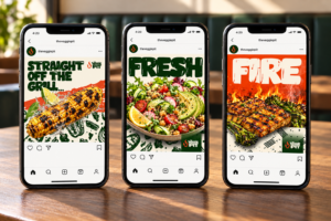
Three story concepts translate the personality into a repeatable campaign: ingredients, flavor, and fire. Each has one clear message and a simple invitation.
CAMPAIGN STORYTELLING
Fresh. Fire. Community.
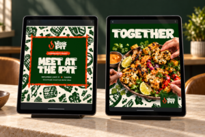
Raw, health conscious ingredients to live fire to a shared meal. The same visual story appear on tables, screens, and environments.
Campaign Graphic Assets
Good Company.
Great Food.
THE OUTCOME
Built To Bring A Community Together
The refreshed direction connects the food, the space, and the conversation. A distinctive mark, two expressive patterns, and consistent art direction give the concept room to grow across physical and digital experiences.