An illustration-led exploration of sports advertising, combining athletic storytelling, energetic color, and campaign art direction.
CONCEPT | ILLUSTRATION | ART DIRECTION | ADVERTISING DESIGN | PRINT APPLICATIONS
BRAND INSPIRATION
Powerade
ROLE
Concept, illustration & art direction
PROJECT TYPE
Speculative print campaign
APPLICATIONS
Poster & magazine interior ad
01/ THE CREATIVE CHALLENGE
FROM ARTWORK
TO CAMPAIGN
How can a single piece of original digital illustration become the centerpiece of an advertising idea? I used Powerade as the subject of an independent concept to explore that challenge through a sports-focused visual story.
THE IDEA
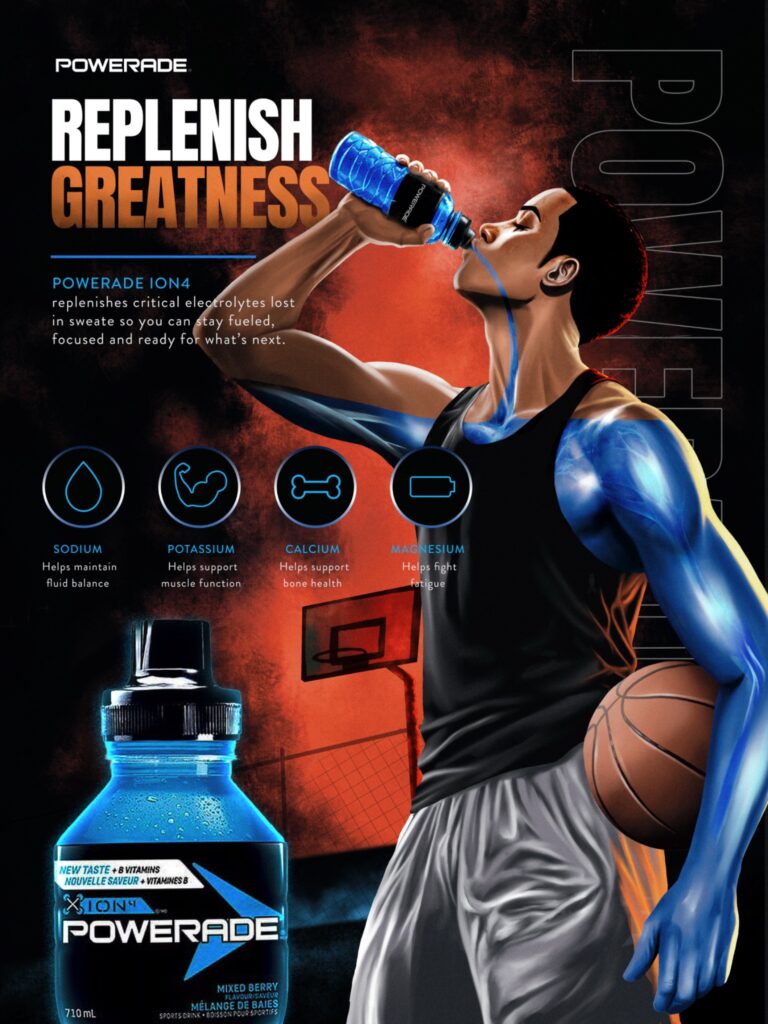
“Replenish Greatness” links hydration to the determination athletes bring to every practice, game, and recovery. The central athlete becomes both a character and a visual metaphor for performance, while the product and message stay recognizable.
CREATIVE OBJECTIVES
Build a high-energy visual with a clear reading order. Use custom illustration as the main storytelling device. Then demonstrate the concept in two practical print formats: a promotional poster and an inside-page magazine advertisement.
02/ THE VISUAL LANGUAGE
BUILT FOR INTENSITY
The illustration carries the campaign. Dramatic lighting, saturated color, and a basketball setting establish the atmosphere, while the headline, product image, and electrolyte icons provide a clear visual hierarchy.
01/ ENERGY IN COLOR
Cool electric blues against a warm red-orange backdrop create contrast and motion. The athlete’s highlighted arm gives the campaign its distinctive illustrative signature.
02/ CAMPAIGN TYPOGRAPHY
Oversized condensed lettering gives “Replenish Greatness” an immediate entry point. Supporting information is secondary, preserving a clear focal order.
03/ PRODUCT AND CONTEXT
The large product illustration, basketball, and electrolyte icon system keep the message rooted in sport and hydration.
03/ CAMPAIGN APPLICATIONS
ONE CONCEPT. TWO FORMATS
A campaign needs to work beyond a single artboard. I explored how the finished design could be presented in two print environments, without redesigning the original composition.
APPLICATION 01
THE POSTER
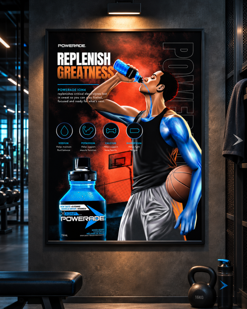
Large-format placement makes the bold headline, athlete illustration, and product the main visual draw. The gym environment helps communicate the campaign’s intended performance context.
Conceptual large-format advertisement mockup
APPLICATION 02
THE MAGAZINE INTERIOR AD
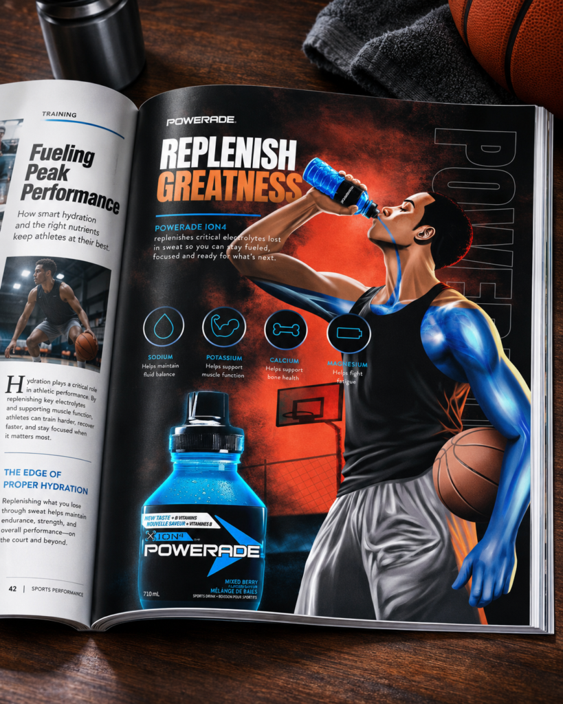
As a full-page advertisement inside a sports magazine, the artwork becomes an editorial-adjacent experience. It is intentionally shown on an interior page — not as a magazine cover.
This project was an opportunity to connect my illustration skills with a broader approach to creative direction. Rather than presenting the image only as artwork, I developed a cohesive campaign composition and explored how it could translate across advertising applications.
The result is a demonstration of how concept development, image-making, art direction, and presentation can work together to tell a compelling visual story.
Portfolio disclosure: An independent speculative concept created for creative exploration. Not commissioned by, endorsed by, or affiliated with Powerade.