
Project Overview
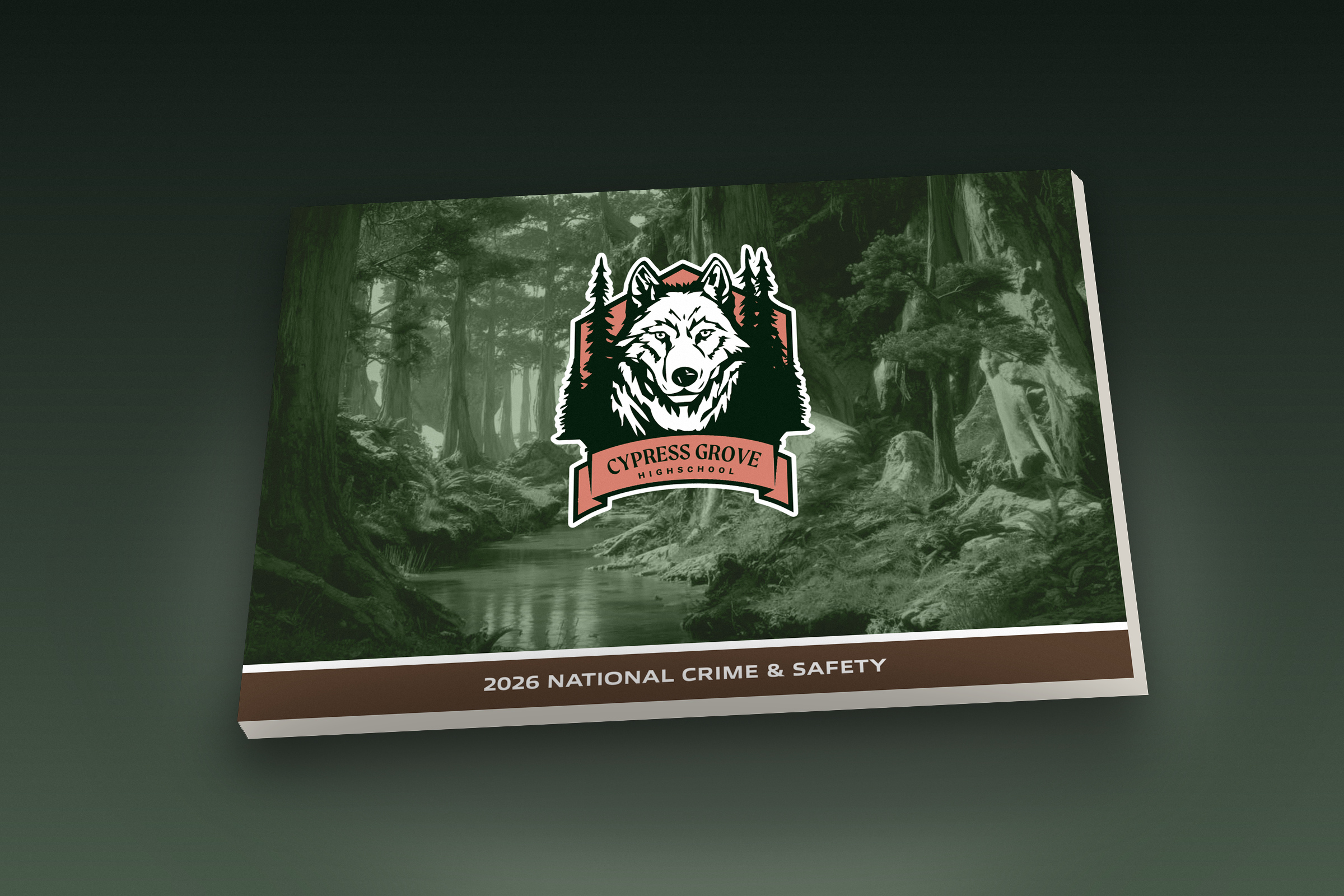
Cypress Grove High School — 2026 National Crime & Safety Report
This self-initiated editorial project explores how complex school safety data can be communicated with clarity and visual impact. I served as Creative Director and Designer, developing the concept, visual system, layout, typography, photography treatment, and data visualization. The report focuses on national data surrounding school crime, bullying, emergency preparedness, and campus security. Rather than using fear-driven visuals, the creative direction emphasizes awareness, preparedness, and trust. Bold statistics, structured infographics, and editorial photography work together to make the information easier to understand. The final publication demonstrates my approach to transforming complex information into a cohesive and engaging visual story.
Campaign Concept
The creative concept centered on presenting serious school safety information in a way that feels clear, approachable, and authoritative. A palette of deep greens and natural tones connects the publication to the Cypress Grove identity while creating a calm, institutional feel. Large typography, oversized statistics, and simplified charts establish a strong hierarchy throughout the report. Editorial photography adds a human element, connecting the data to the students and communities behind the numbers. Monochromatic image treatments help maintain visual consistency without competing with the information. The result is a balanced visual system that communicates safety through clarity rather than fear.
Creative Direction
The creative direction balances institutional credibility with a more contemporary editorial feel. Deep greens, muted neutrals, monochromatic photography, and high-contrast layouts create a visual language that feels serious without becoming overly harsh. Large statistics and simplified infographics were used to make key findings easy to scan and understand. Photography adds a human element, connecting the data to the students, educators, and environments affected by school safety. The layouts shift between clean white space, immersive imagery, and darker spreads to create rhythm and visual variety throughout the report. Every design decision was intended to make complex information feel more accessible, organized, and engaging.
Target Audience
The report was designed for students, families, educators, school leaders, and community stakeholders who need to understand school safety information quickly and clearly. The visual system needed to feel credible enough for administrators while remaining approachable for a broader school community. Data is presented through clear hierarchy, concise explanations, and easy-to-read graphics to reduce the barrier created by dense statistics. The editorial photography helps humanize the subject and keeps the report connected to the people behind the numbers. The overall tone avoids fear-based communication in favor of awareness, preparedness, and transparency. The result is a publication designed to inform multiple audiences while encouraging meaningful conversations around student safety.
Design Strategy
The design strategy focused on turning dense school safety data into a clear and visually engaging editorial experience. Information was prioritized through strong hierarchy, oversized statistics, simplified charts, and concise supporting copy. A consistent grid system helped organize complex content while allowing each spread to feel distinct. Photography was used strategically to add context and emotion without overwhelming the data. Color, scale, and contrast were applied to guide the viewer through the report and emphasize the most important findings. The overall strategy was to make the publication feel informative, structured, and easy to navigate while maintaining a strong visual identity.

FInal Direction
The final direction combines editorial storytelling, data visualization, and institutional branding into one cohesive system. Deep greens, muted tones, monochromatic imagery, and bold typography establish a visual tone that feels serious, modern, and approachable. Large data points create immediate impact, while supporting charts and copy provide deeper context. The layouts alternate between open compositions and immersive image-led spreads to create rhythm throughout the publication. Consistent typography, color, and graphic treatments unify each section while allowing the content to remain the primary focus. The result is a polished annual report that communicates complex safety information with clarity, confidence, and purpose.